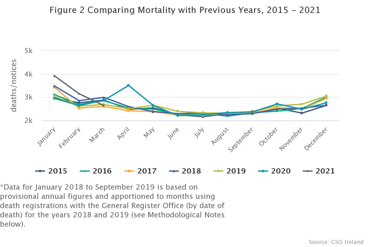
The Central Statistics Office of Ireland has produced an article comparing death rates over the years 2015-2021.
It is clear from the chart that they provide, that there was a peak in deaths in April 2020, which was the same as the peak in deaths that occured in January 2018.
After April 2020, the deaths declined to normal levels for the remainder of 2020, just as they did after January 2018.
This begs the question, why was it not necessary in 2018 to
Close the country down
Destroy the Travel Industry
Destroy the Hostpitality Industry
Require People to wear worse than useless facemasks
Put people under house arrest.
Cut off young and old from family and friends.
Why was none of this necessary in 2018?
Apologists for the Vaccine Industry will insist that we had an out of control pandemic. But the facts do not support that assertion. The deaths peaked in April, and then declined to normal levels.
The only thing that kept the Covid show on the road was a casedemic, which was based on the 90% false positives PCR test being administered to symptomless people, who were told that they “had Covid 19” despite being healthy.
There was another peak in deaths in january 2021. But by this time the waters are muddied by the rollout of the Covid shot. In January it was being given to the most elderly and frail.
Any of those who died in January were deeemed to have died of Covid, despite having just received the Covid shot.
In other words:
2020: Positive PCR test, die within 28 days, from any cause: Died with Covid 19.
2021: Got Covid shot, died within a week: Nothing to see here. Either Covid or undrlying causes.
this has been a year of grand deceptions and fear mongering.
The fear mongering was used to enforce compliance with draconian lockdowns. And the lockdown has been used as the stick, with the Covid shot being used as the carrot that the masses will run to for redemption from the insane lockdown.
It is clever manipulation and deception for sure.
Below is the chart I refer to.
In the full article you can see the chart, and if you hover over any line, you can see the amounts for each month. You will clearly be able to make out the peak in April 2020, the almost identical peak in January 2018, and the slightly higher peak in January 2021.


Recent Comments